Royal Photographic Society
Transforming RPS online: A comprehensive UX overhaul to drive membership and engagement.
Client
Royal Photographic Society
Sector
Membership
Transforming RPS online: A comprehensive UX overhaul to drive membership and engagement.
The Royal Photographic Society (RPS) is the world’s oldest photographic society, and was founded to promote the art and science of photography. It continues this mission to this day through national and regional events, practical workshops, lectures, and community projects across the country.
RPS was planning to undertake a full-site rebuild and approached Box UK to help them create a brief for tendering firms that was user-driven from the outset. The key strategic goals for the new site, collected during an initial requirements gathering session with senior RPS stakeholders, were to be included in the brief:
Providing an improved experience for both members and non-members
Increasing new membership sign-up rates
Improving existing member engagement
Enabling the online renewal of membership
Raising awareness of RPS’ services such as awards and training
The impact of our work for RPS
1.4m
Page views
1.4K
Surveys
60
Information Architecture (IA) Tests

Managing the platform
Using a User Centred Design (UCD) approach, Box UK’s User Experience (UX) consultants carried out a series of research activities with RPS to ensure that the requirements detailed in the site specification would balance the needs of their multiple stakeholders and audiences. These activities included:
- Volunteer workshop: using the KJ technique, a group workshop was run with 50 RPS volunteers to define the organisation’s online brand, values and key target audiences, as well as understand user expectations of the new site and gather feedback on the existing site
- Member survey: completed by 1,400 RPS members, this survey asked specific questions about demographics, usage patterns, tasks and behaviour, usability issues, and new features
- Analytics review: after reviewing 12 months’ worth of data (ca. 1.4m unique page views) a comprehensive analytics review was delivered to RPS, providing valuable insight into content and visitor patterns, group-specific behaviour, search trends, and technology insights
- Expert review: two of our UX consultants independently reviewed the existing RPS site to highlight elements that were thought to provide a poor user experience, along with those elements that worked well and should be carried over to the new site
- Process review: our consultants presented recommendations to improve the new site for both the user and the organisation, focusing on 11 key processes including membership sign-up and renewals
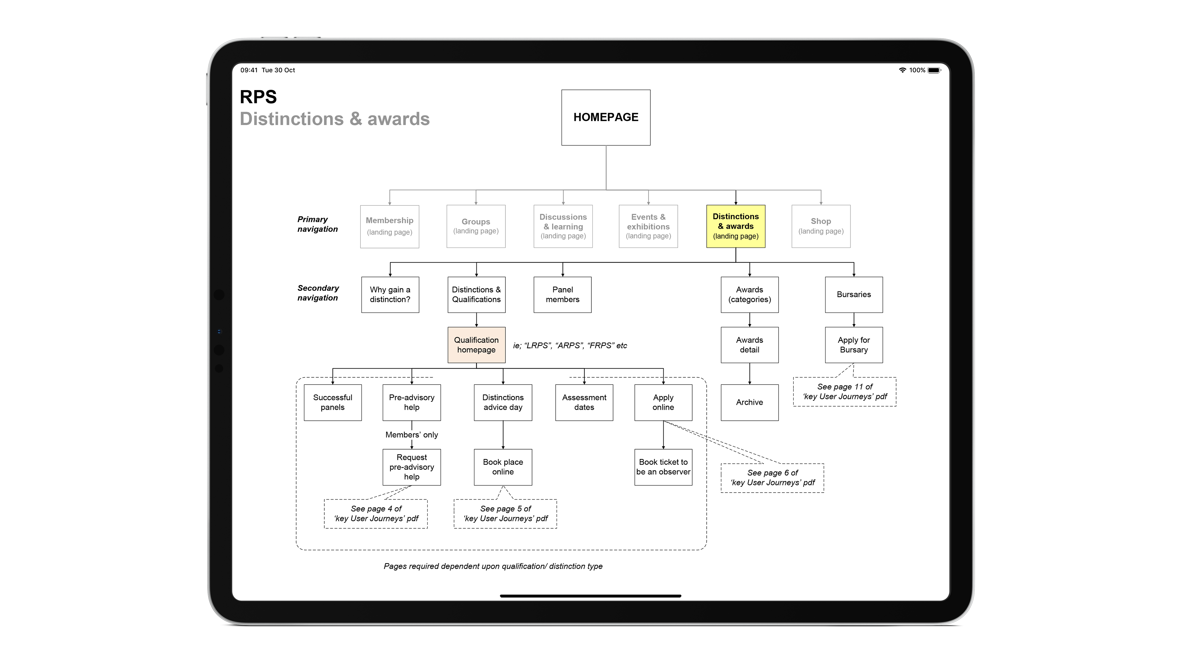
- Information Architecture (IA) testing: running tree testing with 60 users, the site’s existing IA was reviewed to see if it matched users’ mental models of RPS and to assess whether any content was duplicated or missing
Following completion of the workshops, surveys and reviews, over 100 user stories were written to succinctly describe desirable features and capabilities for the site, as told from the perspective of the user. As a pragmatic method to determine the ‘who?’, ‘what?’ and ‘why?’ of user and business requirements, these stories provided RPS with a number of issues to discuss, prioritise and agree upon before going out to tender. The list of prioritised requirements then subsequently allowed tendering development firms to more accurately estimate timescales and costs.
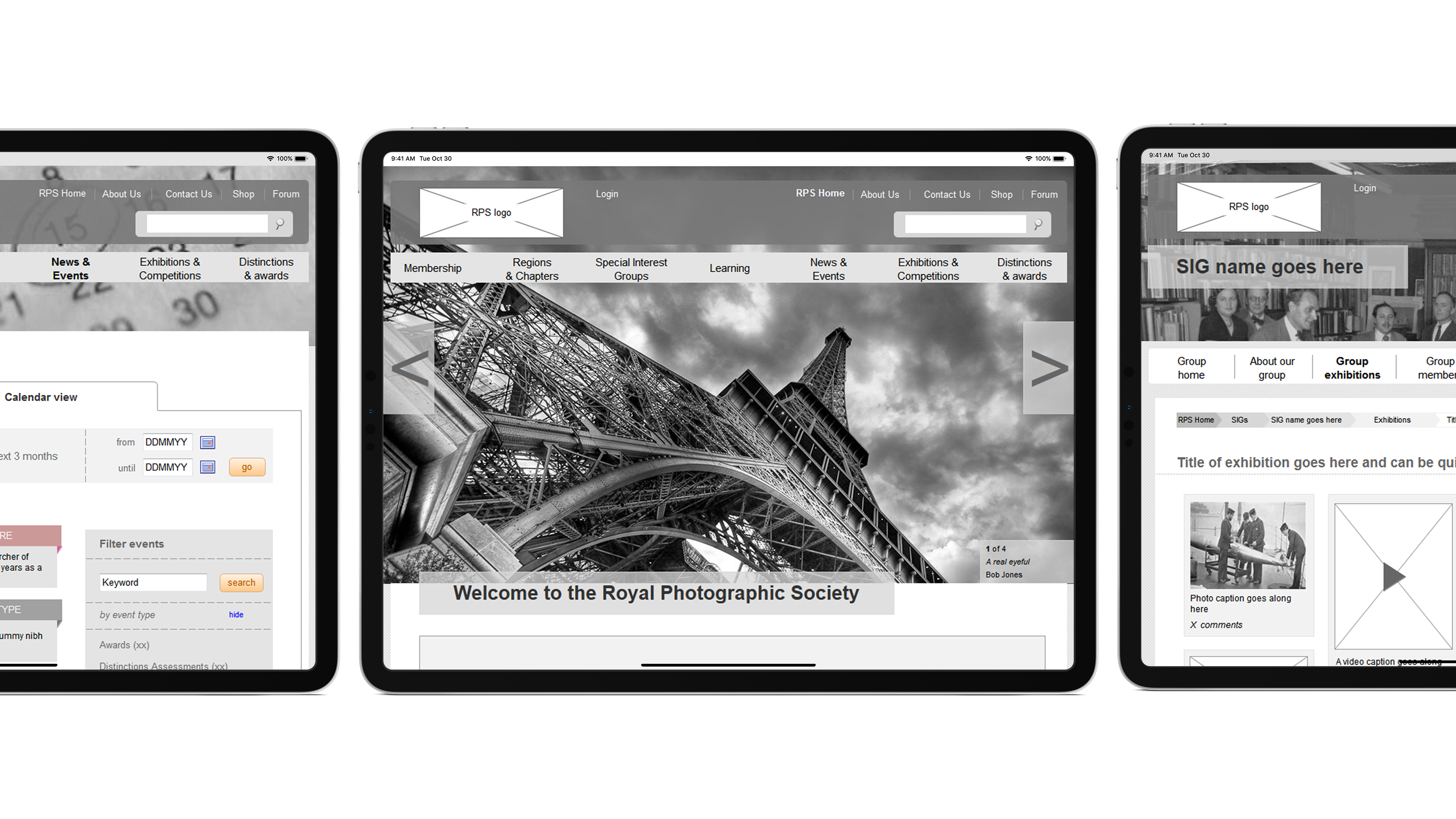
Referencing the user stories, our consultants also then built a HTML prototype that would help RPS and tendering firms better understand how certain features and processes could work. To effectively explore and validate User Interface (UI) ideas for key pages and journeys, over 20 different ideas were built and then tested with members and non-members alike, before being iterated to improve the UI suggestions based on real user feedback.

Transforming an underperforming project
The UCD activities we undertook with the client and their users ensured that at the end of the consultancy phase we had built up a detailed picture of:
- Who RPS’ current users were and how they should best serve them online
- What areas of the existing site were and weren’t working
- How the new structure of the site should house content for maximum findability, and what content was and wasn’t required
- How internal back-office processes could be improved for both the user and RPS
- What features needed to be built to enable users to complete key tasks
Using this information to create the site’s underlying concepts and then validating these with actual user, enabled RPS to complete the essential initial design stage of the project, and provided a new UI to guide future decision-making. As such, the client was able to go out to tender confident that they would be able to effectively assess responses and ensure their new site has the interests, expectations and requirements of their users at its heart.
Talk to one of our digital experts

Tom Houdmont
Head of Business Solutions
Do you have an idea or a project you need support with?
Tom leads Box UK’s Business Solutions team and has over 15 years experience in the web industry. Tom is passionate about creating impactful solutions that solve real problems and deliver the outcomes our clients need.
Or call us on 020 8098 2093
Related case studies
Have a project you’d like to discuss?
Give us a call on 020 8098 2093 or fill in the form and we will get back to you.


