Rentalcars.com
Optimising Rentalcars.com’s loyalty experience: expert insights fuel customer retention and engagement.
Client
Rental Cars
Sector
Retail
An expert assessment of the Rentalcars loyalty proposition helps deliver a compelling experience that keeps users coming back for more.
While attracting new customers is critically important for any organisation, the real value often lies in convincing them to stick around. Acquisition does cost five times as much as retention, after all…
That’s why, for Rentalcars.com, optimising their customer loyalty proposition was imperative. And that’s also why they asked Box UK to review their existing offering, and make expert recommendations for improvement.
Our dedicated User Experience (UX) consultants completed a comprehensive cognitive evaluation of the post-login journey, assessing how closely it aligned with the real-world motivations and behaviours of Rentalcars.com’s users as they travelled across and between different devices. We then presented this information back to the client, outlining a step-by-step plan to help them achieve short-term quick wins, mid-term enhancements and, ultimately, longer-term strategic aims and goals.
Rentalcars.com now have the insight they need to foster a happy, engaged and loyal customer base.

Building engagement
Following a sustained period of impressive growth and success, Rentalcars.com were looking to enhance their customer loyalty proposition, to help drive increased logins and improved retention rates across desktop and mobile devices. And to achieve this, they needed to make sure they had a solid foundation from which to build.
The brief was therefore a far-reaching one, requiring that our UX consultants look at the experience being delivered prior to registration as well as a wide range of common post-login customer journeys, in order to understand how effectively the current platform served user needs and identify any areas for improvement.
To really get into the mindset of Rentalcars.com’s users during this process, our consultants began by undertaking a cognitive walkthrough of the site – stepping through key pages exactly as a user would and assessing how well they performed against key usability principles (also known as ‘heuristics’). We also used our depth of experience in working with membership organisations (where delivering an effective and efficient member login experience is of paramount importance) to explore how psychological triggers such as fear of missing out, the desire for reward and contextual versus non-contextual sign-ups could be used to further drive conversions.
Attention to detail
As Rentalcars.com relies so heavily on its digital presence, it was vital that even the smallest of details were attended to. Alongside the wider UX themes of navigation, information architecture and user interface design then, we also focused on elements such as the language employed, form usability and the ‘at-a-glance’ experience. This enabled our consultants to pinpoint possible areas for improvement that may otherwise have gone unnoticed, including instances of potentially confusing duplicate journeys, mobile considerations for specific tasks such as rental cancellations, and the course correction actions taken when a user forgets their details or experiences other issues while logging in.
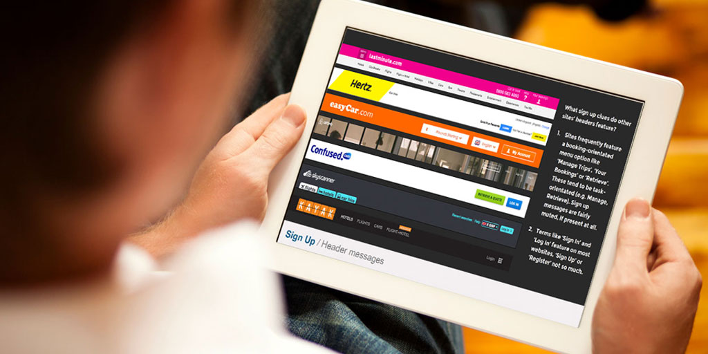
To augment this insight, we also provided Rentalcars.com with a Peers, Innovators and Competitors (PIC) analysis. Highlighting how their login process and loyalty proposition performed against other organisations operating within the sector alongside best-of-breed booking processes from a wide range of industries, this helped the client benchmark their current offering and identify techniques that would help them maintain valuable competitive advantage in the face of growing customer expectation regarding the online experiences to which they’re exposed.
Plan of action
Following the completion of our website health check, we mapped our findings against the client’s strategic objectives, and defined a series of next steps to help them get there. To ensure that the greatest value would be delivered in the shortest possible timescales, these recommendations were further categorised according to the effort involved, versus the potential impact they were likely to deliver.
By working to understand both user needs and client objectives, and taking a laser focus to a particularly business-critical area of the site, we’ve armed them with a solid plan for the future, as well as championing UX best practice throughout the organisation – helping them transform their online experience from one that was already good to something truly great.
Rentalcars.com can now be confident that any changes they make to their loyalty proposition will help inspire exactly that – loyalty – and deliver an experience that users will want to return to, again and again.
Talk to one of our digital experts

Gemma Helyer
Senior UX Designer
Do you have an idea or a project you need support with?
Gemma is a Senior UX Designer who specialises in inclusive and accessible design solutions. She is a passionate advocate for accessibility, inclusive design and is on a personal mission to make the web accessible for all users and of all abilities.
Or call us on 020 8098 2093
Related case studies
Have a project you’d like to discuss?
Give us a call on 020 8098 2093 or fill in the form and we will get back to you.


